Wednesday, May 8, 2013

Final Project Posters with Written Summary

This project has been extremely time consuming, tedious, difficult, and yet, educational. I have delved deeply into several versions of my research question and finally came up with the final topic:
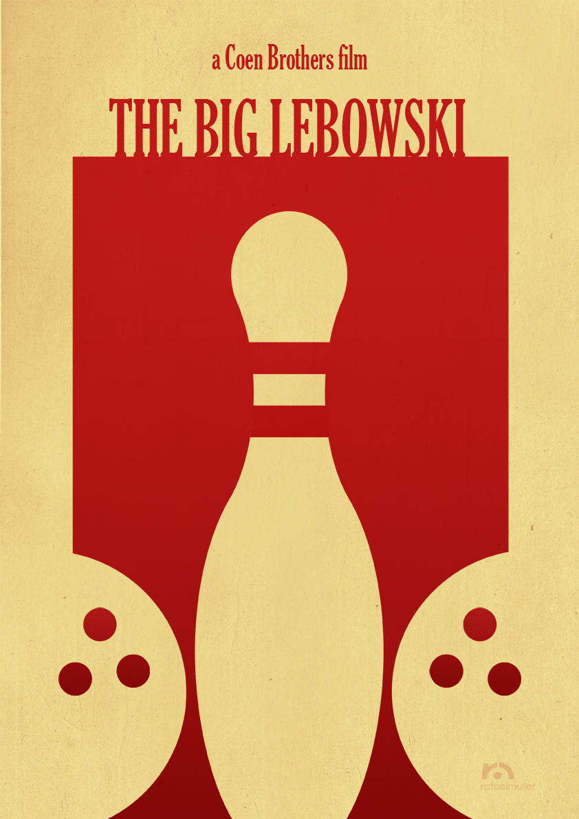
"How can genre be used in movie posters to show a clearer narrative?"
I read this to myself over and over about a hundred times, and then 10 more because it's still a difficult question to answer. I then went back through my posted research material and evaluated the posters from movies that have all become successful, but at the time they were released, were considered to be failures. What I have found is that while a poster can be beautiful, and convey some of the most intimate or iconic situations from a movie, it can still fail to convey what the movie is actually about.

I previously evaluated a few posters from The Shawshank Redemption declaring some of the more basic ones to be superior for conveying the genre. Unfortunately, I had this completely backwards.  The simple images do convey powerful scenes from the movie, and the designs are beautiful, but neither of the ones I listed as a suitable replacement for the original actually are. Anyone who has never seen the movie would have no clue what the movie is TRULY about. They would see it's about a prison break, sure. But, the deeper message, the message of redemption from ones own demons, from finding friendship and honor in the strangest of places, is completely lost in these posters. That said, I am going to reevaluate the posters for The Shawshank Redemption, and will also show the posters of Evil Dead.

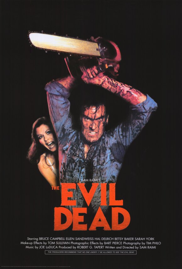
I will start with Evil Dead, which is obviously a horror based on the title. However, when Evil Dead was originally released, it was marketed more as a comedy. Granted, there are some funny parts in the original movie, the main genre, even according to the director, Sam Raimi, is horror. Here are a few of the posters that ultimately failed to convey what the movie was really about:


The first poster even says, "The most ferociously original horror film of the year." And the image is a hand coming up from underneath the ground to strangle a helpless woman. First, one problem is that the white text, combined with the blue background doesn't really convey fear. Most successful horror posters have much darker colors and text.  But, this is not the main issue. The biggest flaw in this poster is that it doesn't express what really happens in the film. It looks like a movie about basic dead people coming back from the grave with no mention of the dark magic, soul swallowing, or the main character, all of which made the movie the indie success it is.

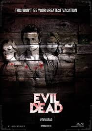
The second poster is from the remake. It is very similar to the first poster except that this time you see the cast.  The problem? It still doesn't show at all what the movie is about, this could be any old Friday The 13th slasher flick from what this image shows. This movie already has a history with its indie fans from the original, but in order to attract the new, younger crowd that requires much more action, fear, and gore, they need to see it.

Both of these posters are good, but only to people who really know what the movie is about.  To illustrate my point, here is my first interpretation of an Evil Dead poster, which is good and will be enjoyed by those who have seen the movie already, but fails to capture what the movie is actually about:


The second poster shows much more about what to expect in the movie.  Gore, a house in the woods, a creepy demon/possessed girl creeping up from under a cellar door.  It also still has a memento from the original movie that old fans will love, the chainsaw:


Next, I will go back to the original movie I posted about, The Shawshank Redemption, which when it released, bombed at the box office, however IMDB and several other major movie sites now list it as one of the best, most influential films of our time. Being that it's a drama, I thought it would be easy to create a poster worthy of its narrative.  This poster turned out to be much harder than anticipated as picking out exactly what type of "redemption" the main character actually finds.

First off, here are a few of the original posters from the movie:


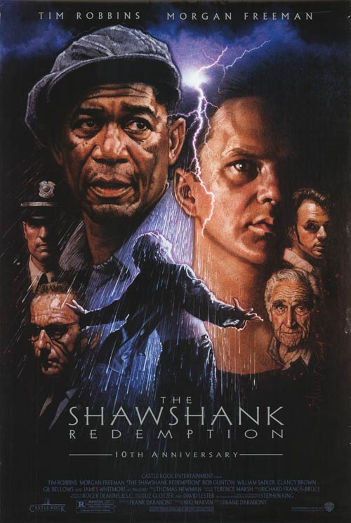
Both are fantastic posters, yet neither successfully show what's happening through genre.  The first comes very close, it shows the characters, and arguably the most iconic scene in the film.  But the entire poster is thrown off by the lightning and the expressions on the characters faces.  This looks like it could be a sic-fi film such as Star Wars. The lightning alone really throws this off, almost insinuating that at some point a character is going to be hit by lightning.  The second is one of my favorite posters, it has the poster that covers his escape hole as well as the chess piece that he carves with the same hammer that sets him free, but the poster fails to say what the movie is about at all. This poster is actually extremely confusing if you have never seen the movie or no nothing of what it's about.

For my first attempt, I created a poster that is equally iconic, but still fails to show the plot.  It's a famous scene, but it's lost on anyone unaware of the narrative:


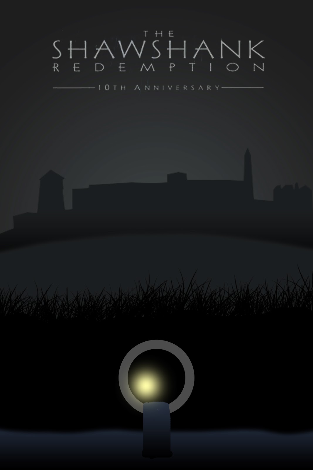
The whole idea behind this poster is to show Andy escaping to freedom through the tunnel with the prison looming in the background.  I got the idea from a similar fan image I saw a long time ago and loved it, meaning that too a fan, the poster does exactly what it's intended to do.  The problem is that it doesn't say what the movie is truly about. Most people would just be confused by this image, and at best take away that it's some type of escape story.

My final poster for The Shawshank Redemption comes the closest to expressing what the true narrative is about, and expresses it through the dramatic, and yet comedic genre of the film:


This poster was extremely difficult to create.  However, I feel this successfully shows the redemption, the friendship, and the conflict.  It highlights many of the iconic characters, but specifically Andy, and shows his change from beginning to end.

When all is said and done, I hope this is close to what you are looking for.  This has definitely been an interesting project, and one that has pushed me to explore more than I ever would have before in plot, narrative, and storytelling in a movie poster design.

Sunday, May 5, 2013

Update

I am beginning to compile the information for the final Case Study that will accompany my final turn in. As for the final poster, I have gathered several images from the movie that I think represent what The Shawshank Redemption is truly about, and will begin to use their likeness in the final, good poster design.

Friday, May 3, 2013

Poster 3

My third poster is the "bad" one for Evil Dead.  Much like the Shawshank poster, it maintains the aspects of a good genre poster, in this case horror.  However, this one does not tell a narrative like the other Evil Dead poster, instead it's dedicated more to the existing fan base and would not work well as a promotional piece.


Wednesday, May 1, 2013

Progress Check - Posters 1 & 2

As I showed in class, I have crafted two posters so far to represent both good and bad design.  The first is a good poster for Evil Dead.  It maintains the simple black, white and red color scheme present in the vast majority of horror film posters which catches the eye quickly and instantly conveys that it is a bloody, gory, horror movie.  Once the attention is captured, it shows the setting and the main evil demon in the chainsaw itself, which reveals the main idea of the narrative.
The second poster I have created is for The Shawshank Redemption.  It is (apparently) the bad one of the two I will create for it as it does not properly convey the story to the viewer.  People who have previously seen the movie will instantly know what it is, however, the idea is to market to a fresh fan base, which this fails at.  The poster needs to show redemption and the human spirit prevailing while also laying out the groundwork that it takes place in a prison.


I will continue to work on new posters over the weekend for each of these movies, and also begin writing my final case study which will also show several other successful/unsuccessful movie posters that already exist which were shown in my previous posting.

Tuesday, April 30, 2013

Evaluating Posters - The Shawshank Redemption

So I think that going through and pointing out certain aspects of what makes a movie poster successful (based on genre of course) is a good step towards crafting my final case study.  This will be the first of a few evaluations I do.

The first poster I will evaluate is the original poster for The Shawshank Redemption.


Overall, the poster is very beautiful, it shows the majority of the main characters, as well as one of the most iconic scenes in movie history (Arms spread after he escapes in the small river).  However, the main issue I have with this is if you have never seen the movie, which was everyone when this poster first came out, you would have absolutely no idea what it was about.  The only hint that it deals with cops and/or guards is the one police style hat worn by Officer Hadley on the far left side.

This poster actually contains a great amount of epic fantasy style layout to it.  Honestly, compare it to the original Star Wars posters and they are fairly similar minus the typographical choices.  It would also be confused with a horror film as the dark coloring, almost evil look on Andy's face, and the typography all resemble that of a horror film.

Now, let's compare it to a couple much more basic posters that I feel convey's what the movie is about in a much clearer fashion.


First off, minimal posters are always eye catching due to the use of negative space, which both of these use well.  Also, both of these make it very clear in both image and text that the movie is about a prison break, and the poster on the left reinforces the quote by showing a Bible.  Instantly you have attracted the viewers attention with the basic image, and within seconds revealed what the movie is about.

I find this one particularly interesting because the movie did not do well in theaters when it was released, however it is named as one of the top movies ever made today.  IMDB still rates it #1 in its list of 100 movies you have to see before you die.  Obviously, there was a major flaw in it's advertising, and I'm convinced that misinterpretation caused some of it.

Monday, April 29, 2013

Poster Images For Case Study


Final Research Question

Ok, the wording may have to be altered slightly, but this is essentially what I'm going with as my final research question:

How can genre be used in movie posters to show a clearer narrative?

Sunday, April 28, 2013

Deliverables

Here is a list of what I plan to present for the final piece:
  • Four movie posters, based on two movies, one good and one bad for each.  This will be based off of the research I have gathered which attempts to pinpoint what actually makes them successful or unsuccessful.
  • A report showing my research, indicating why I opted for certain themes over others to convey a the narrative in a motion piece through a print design.
  • Multiple movie posters for successful and unsuccessful movies that already exist, with specific aspects pointed out showing why they did or did not work in the marketing campaign.

A little update...

So, being that you have given no advice as to how to alter my question, and based on the sites and research I gathered before, I feel that my current question is adequate.  That said, I hope it's what you're looking for as I'm working on storyboards for it now.

Friday, April 26, 2013

Unclear Re-refined Research Question...


After our class the other day, I am thoroughly confused as to what exactly you want as I'm sure many other are as well.  That said, some type of feedback or push in the right direction would be helpful.  Here is a rewritten research question that is about as close as I can get to what I *think* you are looking for:

How can printed design work help to better convey the narrative in a motion piece?

Wednesday, April 24, 2013

Refined Research Question

Which design principles are required in crafting a successful movie poster and how can they be interwoven with what the consumer/non-designer is looking for in a design narrative?

Concepts & Approaches

As you can see from the research materials I have gathered, I have decided to go with the movie poster idea and how it can make or break the films advertising by how it tells a story quickly and effectively at a glance.

My concept for this will be to show several successful movie posters, as well as several that failed.  I hope to gather a vast amount with several variations of movie genres and successful/unsuccessful movies.  I would also like to show movies that were later deemed very good, despite a bad poster and how it hurt the movie.  And I will also show movie posters that marketed well, but ended up disappointing in the theater.  This will allow me to break down what was done correctly and incorrectly in the marketing.

I also hope to analyze third-party posters such as those done by Olly Moss.  I will compare those posters to the original movie posters and gather research from random people about which they prefer and why.  Some example questions I may ask are:
  • Have you seen this movie?
  • If no, have you heard about it and from where?
  • Which of these posters do you find more interesting? Why?
  • Would one of these posters make you want to see the movie over another? Why?
  • Based on the poster, what do you feel this film is about?
Once I have gathered my information, I will compile my research into a presentable fashion, and attempt to craft a few movie posters of my own for already existing films which utilize the principles found in my research, as well as the results found in my interviews in order to craft the most effective poster possible.

Research Materials

Useful links dealing with how movie posters tell a story, and how if they are not done correctly can ruin the advertising for the film.


Tuesday, April 16, 2013

Project Proposal

For my final project, I am considering one of the following:


Topic:
  1. Scheduling App - (The one I had talked with you about before as a possible thesis project for next year) This one is difficult for this project and I would want to talk with you about how exactly I would make it about narrative.
  2. Movie Trailers - I would evaluate how movie trailers develop small narratives of their own based on key points in order to spark interest in the movie itself, while also not giving away any main plot details.
  3. Poster Narratives - Similar to the movie trailers idea, I would evaluate how posters use narrative to spark interest something, while also maintaining enough mystery to draw the reader into wanting more detail.  I could possibly craft some good and/or bad poster(s) to show for this.
Calendar:

It is difficult to say exactly how my calendar will be laid out until an idea is chosen and set in stone.  However, here is a basic idea for it, subject to change.

4/17 - I hope to go over my ideas with you, make changes, and decide on which topic I will be using for sure.
4/22 - Basic research will be done and documented on the blog.
4/24 - Storyboards will be starting and a final "rough" of the core question will be shown for review.
4/29 - Storyboards will be complete, question will be finalized.  The project will be underway.
5/1 - Project will be well underway, "75% complete" as you have requested (hopefully).
5/6 - The project should be nearly complete, at least 90% done.
5/8 - Final project turned in.

(Possible) Research Question:

Using successful and failed movies as examples, I will attempt to determine if advertising played a part in it.  If so, I will evaluate if there is indeed a formula to creating a movie trailer that provides just enough information to show a plot, while hiding the key details that form it.  Can plot be reduced to show a strong narrative, while hiding its key concepts and scenes?